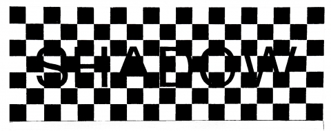
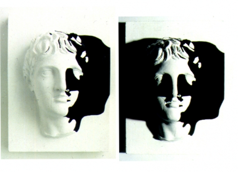
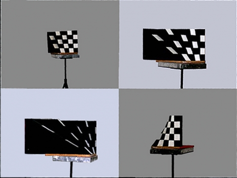
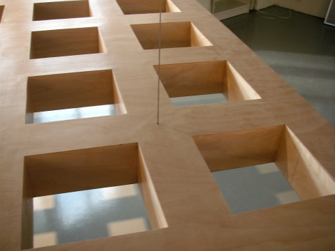
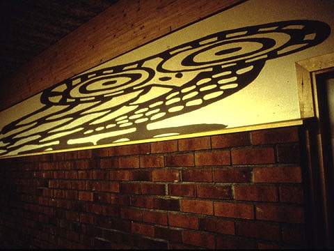
Blacker than black. The letters on this sign are carved out and the black is formed by the darkened void behind. When the sign is illuminated by sharp light from the side, the contrast between the black and white squares appears constant. The contrast between the black letters and the surrounding white area, however, appears to increase as the light brightens. Our sensory perception is tuned to comparisons. There are rarely any absolute measurements for our experiences. What looks black in one context appears more grey in another. Our visual perception covers a fantastic range of contrasts but nevertheless has its limits. Slight contrasts, for instance, may grow imperceptible when a strong contrast is added to the picture. The reason for this is the way in which the brain and the eye process information. Our visual worlds are always a form of incredibly well-balanced compromise.
—> Slutrapport Visuella Världar II (In Swedish)


